This Adam Emoti-Bomb sketchcard was only the second time I’ve painted a sketchcard, (for the first one check here) and it was the first time I attempted a Garbage Pail Kids’ character.
Naturally, Adam Bomb had to be the way to start. With my own twist, of course.
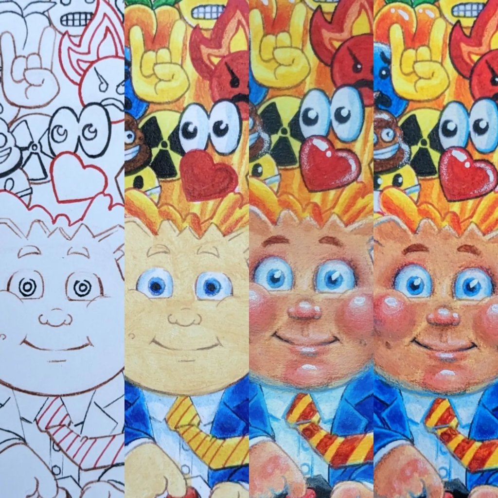
Most cards start with rough work done on a regular sheet of paper and transferred to cardstock through a lightboard or lead stencil (using a 2B or more pencil on the back of the drawing and retracing the design over blank cardstock). This leaves the surface as clean as possible. Nothing is more frustrating than phantom lines from erased pencils criss-crossing a finished piece. I’ll sometimes try and use different coloured lines to reduce hard edges in the piece and that way I can add them later if I want to.
Once I’ve added a clear coat of gesso and let it thoroughly dry, I start blocking in my colours. Depending on the area, and look I want will determine whether I work from light to dark, or dark to light. Deciding which direction to work can entirely change the look of a piece or even how objects within a painting can be perceived by the viewer. Comparing the panels above will help you see which direction I went with most of the painting’s elements.
At the third step it’s about following those directions to flesh out and add depth to the card. Building the shapes that I will polish in the next and final step. This is also the time when I start adding under-shadows. I have to think about light sources here, both visible within the design and having an external influence. Elements like Adam’s explosion will cast a warm light, and an effective way to help those lights pop is to counter with a cool shadow, using blues and purples against the reds, oranges, and yellows. If the flames were blue I’d suggest using warm shadows, reddish purples and browns, umber oranges, to add contrast.
In the final step we add polish and blend the elements into either soft or hard lines. This can mean adding transition colours or blending in whites to add soft highlights before finishing them with a bright white shine. But black is always the last thing. Black added to a painting will almost always draw a hard edge to the elements of your piece. And once it’s there it can be hard to work out into a soft transition. But black can also define what you want people to focus on in your work. It’s a strong tool in any painter’s palette, because a colourful painting without black can wash out at times.
That’s it. Those are the things I work through from step-by-step on a painted sketchcard. I hope you enjoyed it and if you buy one of my cards in the future maybe you’ll be able to see how it came to be!
Thanks for following!
Fox
