Process photos of Rom #1 sketch cover with some behind the scenes info on how I plan out the cover.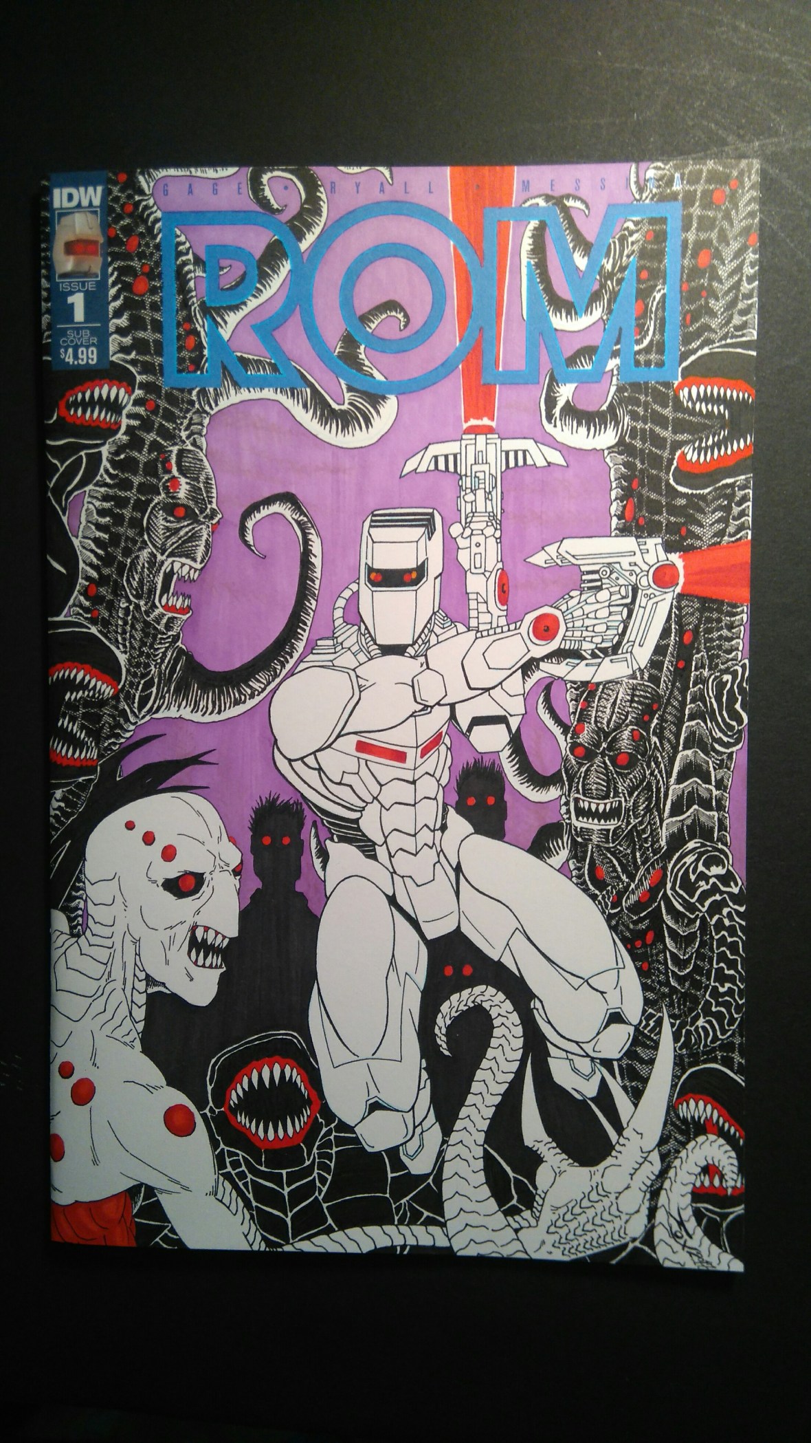
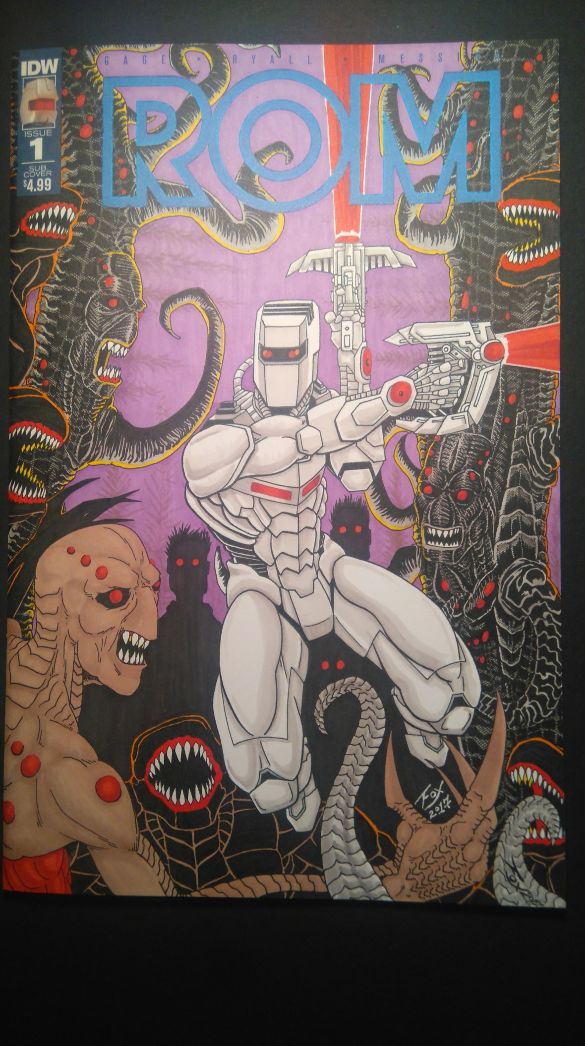
A little splash of colour in the background to keep focus on the details in the foreground.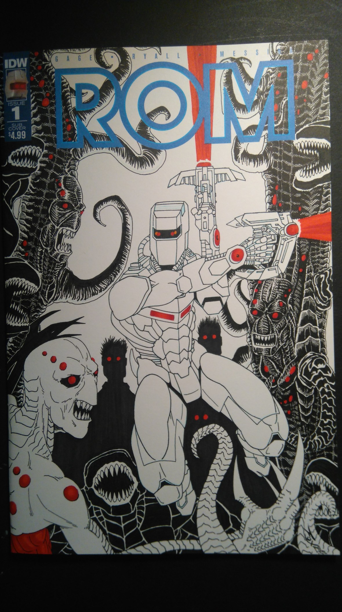
The middle layer is really dark and creepy in contrast to ROM’s clean and pure image as if he’s a white spaceknight leaping through the darkness.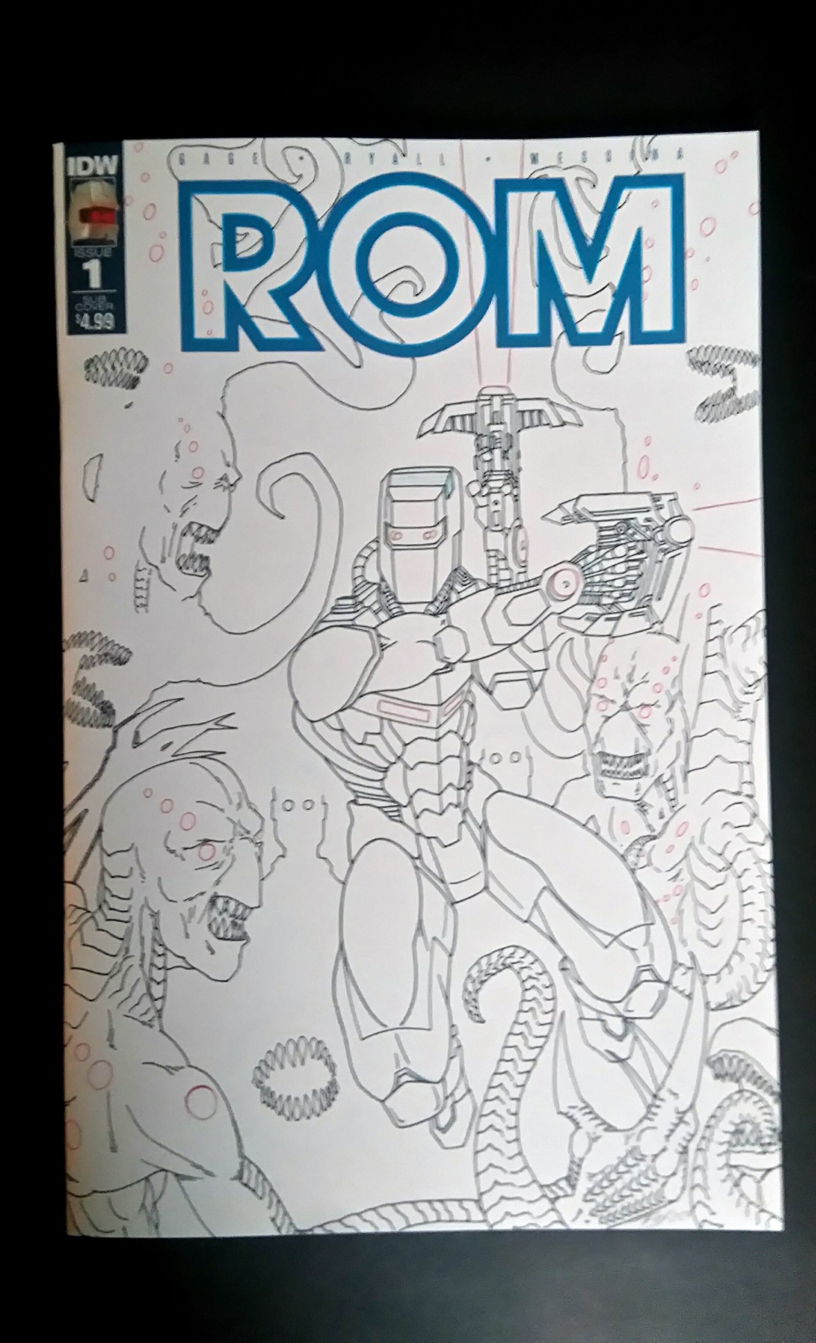
ROM’s placement in the center is intended to draw the viewer’s eye into the image, giving an illusion of depth and layers. The Wraith in the front combined with the reaching tentacles shows our hero is not running away from the fight, but surrounded and leaping into a direction of attack.
